At Servpac, we’re always looking for new ways to reinvent ourselves. We took some time to evaluate what we truly do and decided to give our logo and tagline a fresh makeover. We loved our last logo, so why did we change it? Here’s are the reasons we evolved our brand.
Simplified Solutions. Simplified Logo.
At Servpac, we’ve become a one-stop shop for our customers, expanding our range of solutions to cloud computing, managed services, dedicated fiber internet, VoIP phones and now colocation at our MTP Data Center. These solutions simplify the usually complex process of managing your IT infrastructure, so why not bring that same idea to our logo? A simpler, more distinct evolution of the logo moves us toward a more cohesive visual identity. The new logo still keeps the spirit of the original with its Hawaiian floral icon and bright color palette, but is more refined and withstands the test of time.
Highlight Access to the Cloud
Our logo isn’t the only major change in our branding with an updated tagline – Hawaii’s Cloud Solution. While Servpac now provides various solutions for its customers, they all share one common trait. Every solution offers access to Servpac’s Cloud with advanced security and multiple backup options.
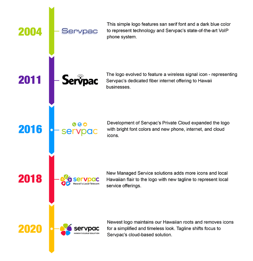
This new logo and tagline marks a new chapter in Servpac’s branding journey that dates all the way back to 2004 with VoIP phone service. Check out the full timeline below.

Over the next few months, look out for Servpac’s new logo on our website, social media, and future advertising. Keep an eye out for our new logo, and as always, we’d love to hear your feedback.

